6. What have you
learnt about technologies from the process of constructing this product?
The software that I mostly used in my product was in design and some elements of Photoshop, while for my blogs I had used some multi media sites to present my work such as Google drive and capzals. The reason for the use of Google drive was to create my audience questioners which would help me to collect data from who had taken part in the questionnaires, this was to get a better understanding of who I would be working to create a magazine for and the styles and content needed to be able to please the audience. For capzals I had created a capzals in order to present my work clearly to the audience of my blog, the content which was put on to capzals was the Images I had taken for my photo shoot . The Photo shoot was so I was able to use the photography I shot and use it for my music magazine.
For my magazine its self, in order to create it I had used two software programs, which were Photoshop and InDesign. When using Photoshop I had used the basics of cutting and layering images for my magazine and how to get the best results. The only use of Photoshop was to improve and edit photos so they were up to standard when placing the images on the magazine. While using InDesign for the rest of the creating on the magazine. There were different types of tools I was having to learn and the formats of what a magazine should look like. another point to be made when making the magazine is to get the sizing and scaling right throughout the magazine.
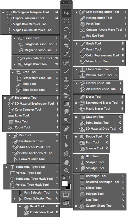
 The tools I used with Photoshop were;
With the quick selection tool I was able to outline the object I want and once that happened was able to create a new layer with only the object its self. The tool was an option to get rid of background and being able to have only the model on the front cover of my music magazine. With the crop tool, I am able to size the picture to the scale I want. While with the blur tool, I used this to smooth out the lines of my images I had cut out from the backdrops. This is so that the edge of the image was smooth and clean cut as possible.

The tools I used with InDesign were;
With the selection and the direct selection tool I am able to arrange and scale objects that I have made. The object you are wanting to alter must be selected in order to be able to control that selected object.
With the text tool I am able to type text for my magazine. There are many styles of text you can pick and choose with lots of variety, you are also able to pick the size of the text.
Another tool that i found helpful was the rectangle frame tool. I had used this to be able to scale and arrange my magazine before the process of producing the magazine this is translucent . While the rectangle tool was used to make boxes and build up layers in the magazine. With this tool there are more shapes to choose from, occasionally I used a circular shape as well. When wanting to have text in boxes its best to have text then a second box, this is because its easier and the best way to have the right scaling, and far easier to arrange and alter.
links to the tutorials of Photoshop http://tv.adobe.com/show/understanding-adobe-photoshop-cs6/
links to the tutorials of InDesign http://tv.adobe.com/show/learn-indesign-cs6/
The software that I mostly used in my product was in design and some elements of Photoshop, while for my blogs I had used some multi media sites to present my work such as Google drive and capzals. The reason for the use of Google drive was to create my audience questioners which would help me to collect data from who had taken part in the questionnaires, this was to get a better understanding of who I would be working to create a magazine for and the styles and content needed to be able to please the audience. For capzals I had created a capzals in order to present my work clearly to the audience of my blog, the content which was put on to capzals was the Images I had taken for my photo shoot . The Photo shoot was so I was able to use the photography I shot and use it for my music magazine.
For my magazine its self, in order to create it I had used two software programs, which were Photoshop and InDesign. When using Photoshop I had used the basics of cutting and layering images for my magazine and how to get the best results. The only use of Photoshop was to improve and edit photos so they were up to standard when placing the images on the magazine. While using InDesign for the rest of the creating on the magazine. There were different types of tools I was having to learn and the formats of what a magazine should look like. another point to be made when making the magazine is to get the sizing and scaling right throughout the magazine.
 The tools I used with Photoshop were;
- quick selection tool
- crop tool
- blur tool
With the quick selection tool I was able to outline the object I want and once that happened was able to create a new layer with only the object its self. The tool was an option to get rid of background and being able to have only the model on the front cover of my music magazine. With the crop tool, I am able to size the picture to the scale I want. While with the blur tool, I used this to smooth out the lines of my images I had cut out from the backdrops. This is so that the edge of the image was smooth and clean cut as possible.


The tools I used with InDesign were;
- selection tool,
- direct selection tool
- type tool
- rectangle frame tool
- rectangle tool
With the selection and the direct selection tool I am able to arrange and scale objects that I have made. The object you are wanting to alter must be selected in order to be able to control that selected object.
With the text tool I am able to type text for my magazine. There are many styles of text you can pick and choose with lots of variety, you are also able to pick the size of the text.
Another tool that i found helpful was the rectangle frame tool. I had used this to be able to scale and arrange my magazine before the process of producing the magazine this is translucent . While the rectangle tool was used to make boxes and build up layers in the magazine. With this tool there are more shapes to choose from, occasionally I used a circular shape as well. When wanting to have text in boxes its best to have text then a second box, this is because its easier and the best way to have the right scaling, and far easier to arrange and alter.
links to the tutorials of Photoshop http://tv.adobe.com/show/understanding-adobe-photoshop-cs6/
links to the tutorials of InDesign http://tv.adobe.com/show/learn-indesign-cs6/


